Dev Insights - Sesh 05
Design Origins - Game Controls
Hey Skaters! This is the fifth entry in our series of devlogs that take a deep dive into several aspects of Beat Skater’s development. In case you missed our last devlog, which discussed our process for debugging and how multi-role specialization creates more space for programmers to experiment, increasing the likelihood to push the design further, it can be found here. For this devlog, Game Director Carter Costes is detailing the history behind Beat Skater’s unique control scheme and how the iterative process narrowed the game into the feel it has today.
“Hey Skaters, for those who are new to these devlogs my name is Carter Costes, I wear a lot of different hats in development but you could definitely refer to me as the Game Director. For everyone returning, wow nice to talk with you again!
As for the topic today, I’m very eager to give a detailed explanation as to how the game’s controls reached the point where they are currently. As I mentioned in our first blog, the game was heavily inspired by skateboarding in both real life and simulated spaces such as the Skate series of games. The controls were initially intended to be abstract reflections of the real motions the foot does to interact with a board. The gif featured below this is a VERY early prototype of what exists today, but it showcases the very first ever version of the controls, where players were expected to just swipe in directions on the board without indicators.
This early version, in my eyes, was a UI catastrophe. Thankfully, this early version received an enormous amount of amazing feedback through both playtesters and well versed professionals which pushed it to be much more user friendly. A major inspiration for new direction the control system would need to take was the Android lock screen, pictured below, where Google created a passcode system that is both intuitive and satisfying to input.
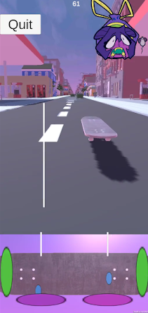
The resulting system is to the left as a gif. The player uses their fingers on the bottom section of the screen to drag a game object and trigger multiple UI collisions with the ultimate goal being to consecutively hit multiple pegs and trigger tricks. In a playtesting build, the two input types were compared and this version was vastly more usable to players, though still had it’s failures in independent player understanding. There were still definite new player experience and usability issues but the design was closer to where it needed to be.
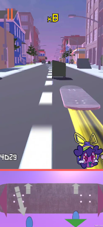
So the iterative cycle of design continued. Design X resolves problem A but has problems B and C. Design Y is created, resolving issues A, B, and C but now only with problem D. Below this I’ve put a few images that demonstrate some milestones for the controls as they continued to work toward being as intuitive and satisfying as possible. One of these milestone features was simple icon changes, just shifting the lines that represented previous player actions to arrows. Some of these changes were much more integral to the interaction design, such as shifting the button-esque pegs to be larger and more zone-esque. To reiterate, there was no individual, large scale overhaul that changed a significant amount at once, which would have likely resulted in overcorrection. This was a long series of small, iterative changes that would each nudge the design to being closer to the final.

.
The shift in design in those last two images was what I would consider a turning point in initial playtester understanding. Past this change, the controls no longer needed to be explained and were performed by playtesters without instruction. The primary reason for this understanding results from the reduction in input complexity, where the number of inputs requirements to perform tricks were essentially halved. From this point, the controls are relatively unchanged from their current version. The addition of turning with device rotation was added, but core trick input has remained the same since this point.
Thank you very much for the opportunity to inform everyone of the design process that was used here at Flip Studios. It’s enjoyable to be able to get my design process out there, and to give players some insight into the great leaps the game made throughout its development. Hopefully this gives a good idea for all the positive iterations that are possible to come to the game going forward!”
Carter Costes
Game Director
Thanks for that Carter! That’s all we had planned for this devlog, but come back in two weeks for a brief dive into the philosophy of our reward structuring. Please leave any questions or comments you have for Carter or the team overall below and we’ll respond! To keep updated on Beat Skater, make sure to follow our Twitter and Instagram. If you’re interested in trying the game, it can be downloaded for free on the Google Play Store or the Apple App Store. Thank you for the time and playing!
Beat Skater
Rhythm Skateboarding Game
More posts
- Patch Notes - September 14th, 2021Sep 14, 2021
- Patch Notes - August 31st, 2021Aug 31, 2021
- Patch Notes - August 24, 2021Aug 24, 2021
- Dev Insights - Sesh 04Aug 23, 2021
- Patch Notes - August 11th, 2021Aug 11, 2021
- Dev Insights - Sesh 03Aug 11, 2021
- Dev Insights - Sesh 02Jul 27, 2021
- Patch Notes - July 27, 2021Jul 27, 2021
- Dev Insights - Sesh 01Jul 13, 2021

Leave a comment
Log in with itch.io to leave a comment.